Images
Image elements are made responsive by default with CSS that sets their
height to auto and their max-width to 100%.
This means that an image will never exceed the width of its container.
You should always add an alt attribute for accessibility.
For performance reasons, whenever possible, you should provide
multiple sizes of an image using the sizes and srcset attributes.
This will allow the browser to choose the best asset for the user.
You should also add width and height attributes to your images.
Although these are overridden by the CSS, they help the browser know
how much space to reserve for the image, reducing layout shifts.
<img
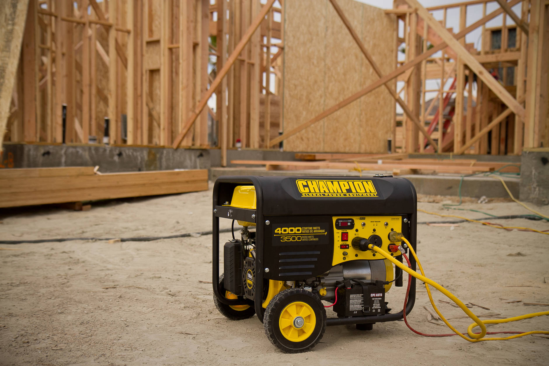
alt="A Champion Power Equipment portable generator in use at a construction site."
src="/images/prototypes/tcs/generator-lifestyle.jpg"
sizes="100vw"
srcset="
/images/prototypes/tcs/generator-lifestyle-small.jpg 470w
/images/prototypes/tcs/generator-lifestyle.jpg 1881w"
width="1881"
height="1254"
/>